Wednesday, February 15, 2006
Word Image: Fire
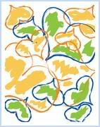
For this assignment, we chose a word and applied styles, transforms and other tweaks so the text illustrated the word's meaning--the font originally was Braggadocio.

Tuesday, February 14, 2006
Monday, February 13, 2006
City Delights, or "Delightful City"
In the current Print Module we've started Adobe Illustrator; providentially, I'd learned some of the program last summer and did a little more in late fall, so it's not totally obscure. For the first part of this small, 20-point project, we had to trace shapes with the [scary?!] pen tool; the second phase, the one we turned in for grades, was to use the shapes to create a picture of anything but a beach scene. The shapes – which we could break apart into their separate components – were umbrella, cloud, waves, sailboat, palm tree, seashell and delivery truck. After I finished tracing, I spent a ton of time working with fills, lines, gradients, transforms and stacking orders. Then, when time got short, I designed an energetic, optimistic, happy urban paradise. 

Wednesday, February 08, 2006
summer dreams
We did this project in ImageReady, PhotoShop's web formatting component; it's a quick comp of the splashpage of a website, something you'd prepare for a client – without spending unreal amounts of time doing something that might not fly – to give them an idea of what you had in mind. This image includes additions not required by the minimum assignment directions.
Friday, February 03, 2006
photo retouching and colorizing: Harwich House
Wednesday I turned in my second major project; these notes are from my Artist's Statement.
194 Church Street, Harwich, Massachusetts
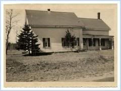
Image source: for this assignment I chose a black and white photograph of the house my grandparents first owned and later lived in at 194 Church Street in Harwich, on the vacation peninsula of Cape Cod, Massachusetts; they probably took this shot shortly after buying the property in the early 1950s. Clapboard siding and shake shingle roofs characterize most New England farm-style houses built on the Cape during the mid-to late 19th century.
Over the past few years I've scrapbooked many of the better snapshots of this house, but this one was in close to disreputable condition, making it a great candidate for repairing and colorizing!
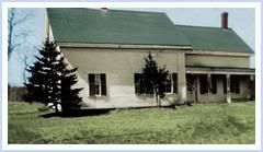
Hoped-for outcome and rationale: because I have pictures taken after my grandparents made repairs, improvements and additions to both house and yard, I planned the colorizing to reveal what the house would have looked like when they first bought the property, before starting renovations and transformations.
Regarding the hues: always trying to avoid the temptation to imagine this project was supposed to look like a color photograph, I took some freedom with the color. I made the siding on the house creamy white, although an almost chalky white tends to be more typical of houses of that period in that geographical area. In addition, I aimed for pleasing (to me) interactivity among the roof, grass and sky colors. The original roof probably was green, but it might have been gray or brown.


Subscribe to:
Posts (Atom)
